
 Back to Blog
Behaviorally needed a website that could keep pace with its platform—one the internal team could edit confidently and one that held up as well on mobile as it did on desktop. We rebuilt the site from the CMS up on HubSpot Content Hub: a drag-and-drop backend, more than 15 custom modules, full mobile optimization, and a branding-first content pass across every core page. Since launch, session time is up 15%.
Behaviorally sells speed. Its platform helps shopper-insights teams read the market faster than the competition can react to it, and the technology backs up that pitch. As the platform grew more sophisticated, the website needed to keep pace with it—especially on mobile, where most prospects were actually finding the company for the first time.
For Behaviorally, that meant the website couldn’t just be marketing collateral. It needed to be the first proof point a prospect saw that this company moves as fast as it says it does.
Room to Grow Into
The bigger opportunity was structural. The site had never been rethemed on HubSpot’s CMS, so it was still running on the same layouts it launched with—built for a moment when the platform, and the company, looked different than they do now. Making changes meant working carefully around a rigid design, which naturally made the team more cautious about updating content as often as a fast-moving platform needs.
That’s the gap we set out to close: giving Behaviorally a site that could evolve as quickly as the product does, without a rebuild every time something needed to change.
Rebuilding the Foundation First
We didn’t treat this as a redesign layered on top of the old bones. We rebuilt the theme from the ground up, starting with a modernized backend built for drag-and-drop editing, so the Behaviorally team could reorganize and update pages without looping in engineering for every change. Mobile and desktop got separate spacing controls, treated as genuinely different experiences instead of one layout awkwardly resizing into the other.
The content needed the same kind of rethinking. The existing copy spent most of its energy explaining Behaviorally to itself—what the platform does, how sophisticated it is—instead of speaking to the shopper-insights professionals actually reading it, who already know the fundamentals and don’t need the 101 version. We rewrote it with a branding-first approach to shift that center of gravity, from talking about the company to talking to the customer.
Some of the best decisions were the smaller, more deliberate ones. Pink is part of Behaviorally’s brand identity, and the team was clear early on that they didn’t want the site to read as “the pink brand”—a real risk when a color that vivid gets treated as a default rather than an accent. Using it sparingly and with intent, instead of leaning on it as a dominant palette choice, is the kind of restraint that keeps a rebrand from tipping into caricature.
What Got Built
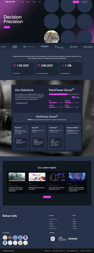
The rebuild touched every core page—Home, About, Products, myBehaviorally, Contact, and Insights—plus two new pages designed and drafted from scratch. Underneath the pages, we built more than 15 custom modules: an animated homepage hero that cycles through imagery across a grid of dots, echoing the dot in Behaviorally’s own logo; animated counters for key data points; a scrolling logo bar for social proof; and an interactive recreation of Behaviorally’s PPS Score Card and Grid of Products, rebuilt with real animation instead of a static graphic.
We also added a secondary in-page navigation module, a scroll-triggered product card slider that reveals new cards as visitors move down the page, a color-coded location map for the contact page, and a visual step-flow module that walks through how the platform actually works. None of it would have mattered without the unglamorous part underneath—refactoring the backend code for performance and optimizing every page for mobile, so the visible improvements had something solid to run on.
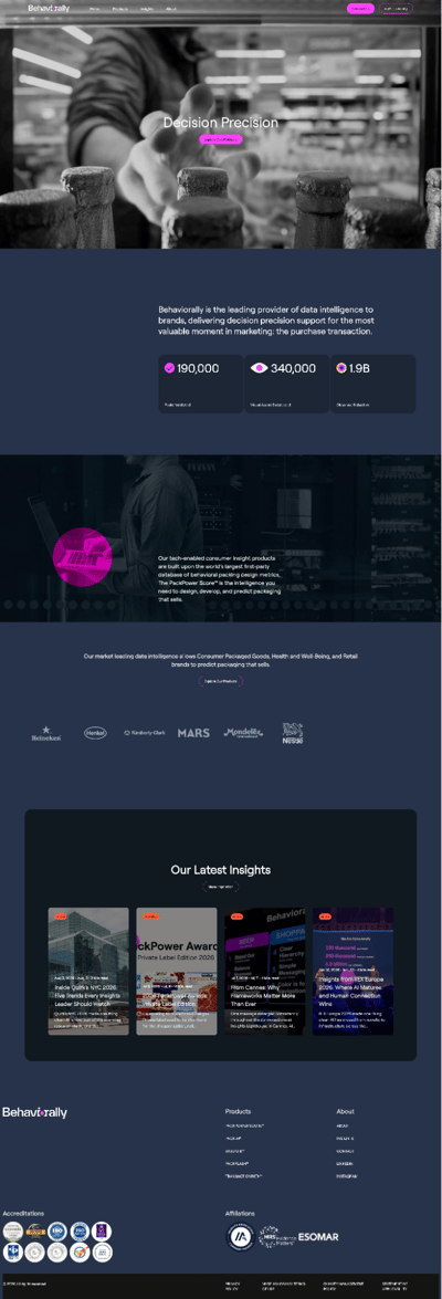
Before
What Changed
The first thing any visitor would notice is a site that performs the way a modern platform’s front door should on a phone. But the change that matters more day-to-day is internal: the Behaviorally team can now edit and rebuild pages themselves, quickly and with confidence.
That shift is already showing up in the numbers—session time is up 15% in the 30 days since launch, inside the same window as the site’s release.
After
The Takeaway
A platform that’s outgrown its own website has a credibility problem before it has a marketing problem. Prospects size up a company’s sophistication from the site first, long before a sales call. For Behaviorally, closing that gap meant starting underneath the visible layer—a backend the team could actually work in—before anything else could hold up.
If that tension sounds familiar—a product that’s moved faster than the site representing it—that’s the kind of rebuild we take on. Talk to us about a CMS rebuild.